Last reviewed: 14 Sept 2026
Reviewer: Sam Chugtai, Managing Director at Flow Office
Colour is one of the most affordable and least disruptive ways to change how a space impacts those working in it. The colour on your walls affects mood, focus and energy, and it shapes what a visitor assumes about your business before anyone says a word.
Key takeaways
- Colour changes how people feel, focus and perform at work, not just how a space looks.
- Brand colours are a starting point, not the automatic answer. A bright corporate colour can be too engaging for a heads-down floor.
- A 60-30-10 ratio keeps a space on-brand without overwhelming it: 60% calm neutrals, 30% a secondary brand colour, 10% your primary brand colour as accents.
- Each colour does a different job: blue for focus, green for calm, yellow for creativity, orange and red for energy. These work in small doses, and neutrals as the backbone.
- Light changes colour. Always test a swatch on the actual wall, in daylight and under your office lighting, before you commit.
So this raises a question worth asking before you pick up a paint chart: should your office just be painted in your brand colours?
Not always. Here's how to think about office colour like a designer, zone by zone, and how to decide where your brand should show up.
Summary
- Office colour is a business decision
- Why aren't brand colours always the right choice?
- The 60-30-10 rule
- Office colour psychology, colour by colour
- Matching colour to the job each space does
- Where and how to apply colour: walls, feature walls and beyond paint
- Small offices and difficult spaces
- Why does a colour never look the same twice?
- Designing for everyone: inclusive and neurodiverse-friendly colour
- How to choose your office colours
- Getting your office colours right
Office colour is a business decision
Choosing office colour is a decision that affects how your people work and how your business is seen.
Colour affects mood, focus, energy and wellbeing
A room painted in the wrong colour can leave people flat, distracted or on edge, even if they can't say why.
The right colour in the right place can help a team concentrate, collaborate or simply feel better at their desks.
The cost of getting it wrong
Grey, beige and stark white offices are linked to low mood and low energy. Industry research points to a real productivity cost from dull, uninspiring workplaces. A safe, neutral scheme can end up costing you more in engagement than it saves in decision-making time.
First impressions
People judge a business by the colours on its walls before they judge anything else.
A reception area or meeting room sets an expectation the moment a client walks in, so your colour choices carry weight that the rest of the office doesn't need to.
Why aren't brand colours always the right choice?
It's tempting to paint every wall in your logo colours. It feels safe and consistent. But defaulting the whole office to your brand palette is usually a mistake.
When a brand colour fights the work
A bright, bold or fiery corporate colour might work brilliantly on a website or a van, but on the wall of a heads-down floor, it may add too much stimulation to the space, making it difficult for people to concentrate.
What reads as energetic in a logo can be exhausting in a space you sit in for eight hours a day.
The 60-30-10 rule
If you need to have branding in the space, this ratio is a simple way to achieve this without going overboard. The 60-30-10 rule is a rough guide to ratios in your colour palette.
- 60% calm neutrals
- 30% a secondary brand colour
- 10% your primary brand colour, used as an accent.
This keeps your brand present without it taking over the room.
Where to prioritise brand colours in your office
Reception, meeting rooms and other client-facing areas are where your brand should carry the most weight. Work zones, where people need to focus for long stretches, should lean on colours chosen for productivity instead, even if that means straying from the brand palette.
A subtle nod or a full statement
You can choose how loudly your brand shows up. A single feature wall in your primary colour, or branded furniture and signage against a neutral backdrop, can say as much as painting a whole room, without the drawbacks.
Office colour psychology, colour by colour
Each colour does a different job. Here's a quick reference for what each one does, where to use it, and where to be careful.
Blue is the focus and efficiency colour. It's linked to a lower heart rate and better concentration, which makes it a strong choice for focus zones, meeting rooms, and teams doing analytical or detailed work. Watch that a cold shade of blue doesn't tip a room into feeling clinical.
Green is calm and easy on the eyes over a long day. It suits workstations and breakout areas, and it pairs naturally with plants, which strengthens the effect.
Yellow brings optimism and creativity. It works well in brainstorming rooms, innovation spaces and reception areas, but use it sparingly. Too much yellow causes eye fatigue.
Orange adds energy and cheer. It suits creative studios and breakout areas, but it works best as an accent rather than a base colour.
Red is stimulating and raises heart rate, which is useful in small doses in active or physical spaces. Too much red causes stress, so treat it as an accent only.
Neutrals, including grey, greige, warm white and off-white, are the professional backbone of most office schemes. They prevent sensory overload, but watch that grey and white don't drift into cold or clinical territory. Warm them up where you can.
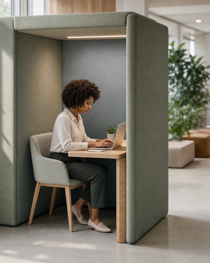
Matching colour to the role of each area
| Area Type | Colours |
|---|---|
| Focus and heads-down zones | Calm blues, soft greens and muted greys |
| Collaborative and creative spaces | Yellow, orange and other energising accents |
| Meeting rooms | Blue, or warmer, deeper tones like deep blue, warm grey or burgundy |
| Breakout areas | Restorative greens and warm neutrals |
| Reception and client-facing areas | Brand-led, welcoming and professional tones |
This is where a fit-out approach earns its keep over a paint chart from a DIY shop: a plan that treats each zone differently, rather than one colour for the whole floor. See our guide to modern office design for how this can work in a wider refit.
Where and how to apply colour: walls, feature walls and beyond paint
Colour is more than a tin of emulsion, and paint isn't the only way to bring it into a room.
Feature wall or whole room
A feature wall lets you use a bold or brand colour safely, contained to one surface, while the rest of the room stays calm. Painting a whole room in a strong colour needs a much lighter touch, or it risks becoming overwhelming.
Beyond paint
Wallpaper, panelling, timber slat walls and textured or concrete-effect finishes all add colour, pattern and texture without a paintbrush. These finishes also add warmth and interest that flat paint alone can't.
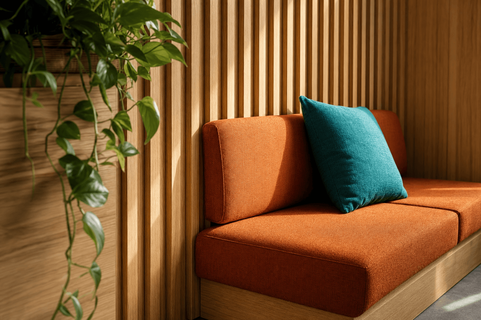
Our piece on industrial design ideas for your office covers several of these finishes in more depth, and our guide to mixing and matching styles shows how to blend them with a broader palette.
Furniture, screens and accessories as colour
Seating, dividers, storage and other office furniture can introduce colour without repainting a single wall. This is often the easiest way to add or adjust colour in a space that's otherwise finished, and it's easy to change again later if your needs shift.
Biophilic colour
Biophilic design means bringing natural elements, like plants and daylight, into a built space. Plants add a natural green that supports calm and, as a bonus, improve air quality.
Small offices and difficult spaces
A small office or an awkward, period building needs its own approach to colour.
Light colours create space
Light colours reflect natural light and can make a small office feel larger than it is. They're the first tool to reach for in a compact or low-light space.
Adding warmth
A scheme that's too light can feel cold or clinical. Add warmth through a warmer white, a wood tone, or a single warm accent so the space feels welcoming rather than bare.
Monochrome and two-tone schemes
A monochrome scheme, using tones of a single colour, or a simple two-tone scheme, helps a small or awkwardly shaped space avoid feeling overcrowded or busy.
Colours on sample cards can look different on the wall
The same paint colour can look entirely different depending on the light it sits in. This is one of the most common reasons an office colour scheme disappoints once it's on the wall. It’s worth planning for this.
Natural light vs artificial light
Natural daylight and artificial office lighting render colour differently. A colour that looks calm and neutral under daylight can shift noticeably under fluorescent or LED lighting.
Room aspect
The direction a room faces matters too. North-facing rooms cool colours down, while south-facing rooms warm them up, so the same paint can read differently from one side of the building to the other.
Test your swatches
Always test a swatch directly on the wall, at different times of day, under both natural light and your actual office lighting, before you commit to a full room.
Designing for everyone
Office colour isn't neutral for everyone in the same way. A scheme that works for most people can be genuinely difficult for others.
Why bright reds and yellows can overstimulate
Bright reds and yellows, and other high-stimulation colours, can overstimulate some neurodivergent employees, meaning people whose brains process sensory input differently from what's typical. What reads as energising to one person can be overwhelming to another.
Calm neutrals as a baseline
Calmer neutrals and softer tones give a steadier baseline across a floor, so the space doesn't demand more from anyone than it needs to.
Giving people choice
Quiet zones and adjustable spaces give people a choice about the environment they work in, rather than forcing one scheme on everyone regardless of how they respond to it.
How to choose your office colours
Once you understand what colour does, choosing your own scheme becomes a repeatable process rather than a guess.
Start with the work
Before you look at a single paint chip, audit what each area of your office is actually for. The job a space does should decide its colour, not the other way around.
Start neutral, layer accents
Build from a calm, neutral base, then layer in accent colours where they earn their place. This keeps the scheme flexible if your needs change later.
Involve your employees
Ask the people who'll spend their days in the space what they think, and align the results with your brand.
Test before you commit
Test your chosen colours as swatches, in the room, under real light, before any wall gets fully painted.
When to bring in a design team
A costly colour mistake is expensive to undo across a whole office. Bringing in a design team early avoids repainting a floor twice and gets the brand-versus-productivity balance right the first time.
Getting your office colours right
Two studies are worth knowing if you want the evidence behind these choices, rather than just the assertion. Research from the Sauder School of Business (2009) found that red improves performance on detail-focused tasks while blue improves performance on creative tasks. Another 2006 study in Sweden found that mood is also influenced by workplace colour and lighting.
The common thread through all of this is that office colour is an important decision. Brand colours are a starting point worth having in mind, but the work each space does should shape the final choice, not your logo alone.
If you'd like to see how this would look in your own space, our 3D space planning service lets you view a colour scheme in your actual office before anything is repainted. You can also read more about our approach on our office design page.
Frequently asked questions
What colours are best for productivity in an office?
Blue supports focus and concentration, green is calming over long working hours, and neutrals prevent sensory overload across a floor. The one to choose depends on the job each space does, so the answer is usually a mix, rather than one colour throughout.
Should office colours match brand colours?
Not always, and not everywhere. Brand colours earn their place in reception, meeting rooms and other client-facing areas. In focus and work zones, colours chosen for productivity usually serve your team better than a strict brand match.
What colour is best for focus, and what colour is best for meeting rooms?
Blue is the strongest choice for focus zones, thanks to its links to lower heart rate and better concentration. Meeting rooms usually suit blue too, though a warmer or deeper tone can work depending on what the room is used for.
Sources:
Mehta, R. and Zhu, R.J. (2009) "Blue or Red? Exploring the Effect of Color on Cognitive Task Performances," Science, 323, 1226-1229 (Sauder School of Business, University of British Columbia). https://pubmed.ncbi.nlm.nih.gov/19197022/
Küller, R., Ballal, S., Laike, T., Mikellides, B., & Tonello, G. (2006). The impact of light and colour on psychological mood: a cross-cultural study of indoor work environments. Ergonomics, 49(14), 1496–1507. https://doi.org/10.1080/00140130600858142